
The Evolution of Tech Logos and Their Impact on Marketing
-
Aug, Thu, 2024
The Evolution of Tech Logos and Their Impact on Marketing
Introduction
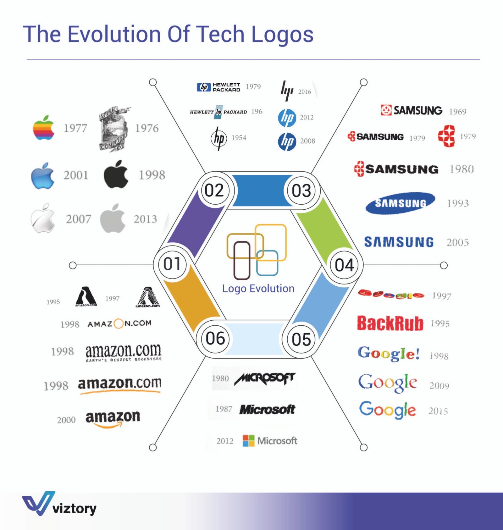
The logos of tech companies embody their identity and evolution over time. The attached image provides a glimpse into how the logos of some of the world’s largest tech companies, including Apple, HP, Samsung, Google, Amazon, and Microsoft, have evolved. This evolution highlights how simple design changes can reflect significant stages in a company’s growth and shifting strategies. This evolution can also be tied to marketing, where logos play a critical role in building brand identity and attracting customers.
Analysis of Logo Evolution
Apple:
- Apple’s logo began as a complex design featuring Isaac Newton under an apple tree. In 1977, it transformed into the iconic bitten apple with rainbow stripes, a design that reflects the simplicity of technology and the strength of the brand. In the following years, the logo was further simplified, maintaining the basic shape but adjusting colors and effects to align with the digital age.
HP (Hewlett-Packard):
- HP’s logo has undergone several changes over the decades, transitioning from a simple text-based design to a more modern and contemporary version in 2016. This transformation reflects the company’s vision of keeping pace with rapid technological advancements while preserving its long-standing heritage.
Samsung:
- Samsung’s logo evolved from a simple design in the 1960s to the recognizable blue logo in the 1990s. This change mirrors the company’s transformation from an electronics manufacturer to a global leader in technology.
Google:
- Google started as a small company under the name “BackRub,” then grew into one of the largest search engines in the world. Google’s logo has changed several times, but it has always maintained its vibrant colors and playful spirit, reflecting the company’s commitment to innovation and simplicity.
Amazon:
- Amazon’s logo began as a text-based design reflecting the company’s beginnings as an online bookstore. As Amazon expanded to become the world’s largest online retailer, the logo evolved to include a smiley arrow linking the letters “A” and “Z,” symbolizing the wide range of products the company offers.
Microsoft:
- Microsoft’s logo transitioned from a simple text-based design in the 1980s to a multi-colored version in 2012, reflecting the integration of the company’s products and its comprehensive approach to delivering diverse technological solutions.
The Impact of Logo Evolution on Marketing
Building Identity and Brand:
- Logos play a crucial role in building a company’s identity and enhancing its brand. The evolution of a logo reflects the company’s own development and serves as a powerful marketing tool that attracts customers and builds trust.
Adapting to Market Changes:
- Changing a logo helps companies adapt to market and technological shifts. A new logo can reflect new innovations or emerging trends in the market, making the brand more aligned with customer expectations.
Attracting Target Audience:
- An attractive, well-designed logo can capture the attention of the target audience and create an emotional connection with the brand. This connection enhances brand loyalty and increases the chances of success in the marketplace.
Conclusion
The evolution of tech company logos reflects not only changes in design but also serves as an indicator of the transformation of companies and their strategies. A logo is an essential part of a brand’s identity and has a direct impact on how customers perceive the company and its products. By understanding the importance of logo evolution, marketers can use it as a powerful tool to build and enhance a brand in a competitive market.